Early signalConfidence describes how consistent the observed preference is at this sample size, using a 95% Wilson score interval. It is not a claim about the wider population — a taste test tells you what these humans picked, not what everyone would pick.46 humans · target 50
The split95% intervalConfidence describes how consistent the observed preference is at this sample size, using a 95% Wilson score interval. It is not a claim about the wider population — a taste test tells you what these humans picked, not what everyone would pick.
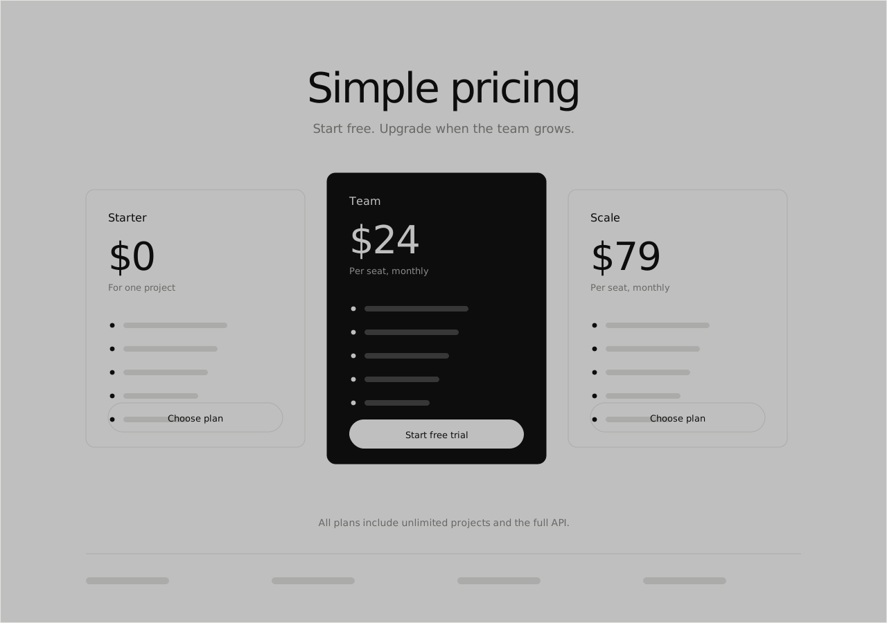
AThree cards46%21 boops
95% interval 32%–60%
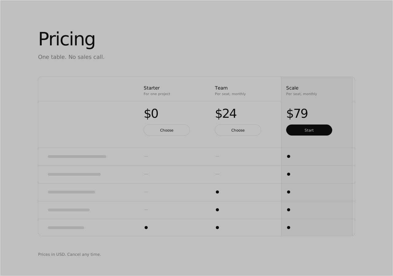
BComparison table54%25 boops
95% interval 40%–68%
The leader's interval still crosses 50%, so this sample can't separate the two.
What people saw
AThree cards46%BComparison table54%
Why they picked it
Easier to understand9
More useful9
Cleaner8
More premium6
I'd click this1
Reason tags are optional, so these add up to less than the total vote count.
Reading the comments…
In their words
4
AI'd click this
A has one obvious button. B made me hunt.
BMore useful
I want to know what I lose by going cheaper. Only B tells me.
ACleaner
Cards, because the table looks like a spreadsheet I have to study.
BEasier to understand
Table wins for comparing. Cards make me open three tabs in my head.
Got a decision of your own?
Two versions, one question, and people who have no reason to be polite about it.